事件分析
一、引入案例
新增用户和 DAU 作为常用指标,经常需要分析和展示,我们可以用「事件分析」的功能来对场景指标进行分析和呈现。
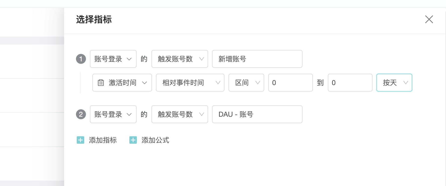
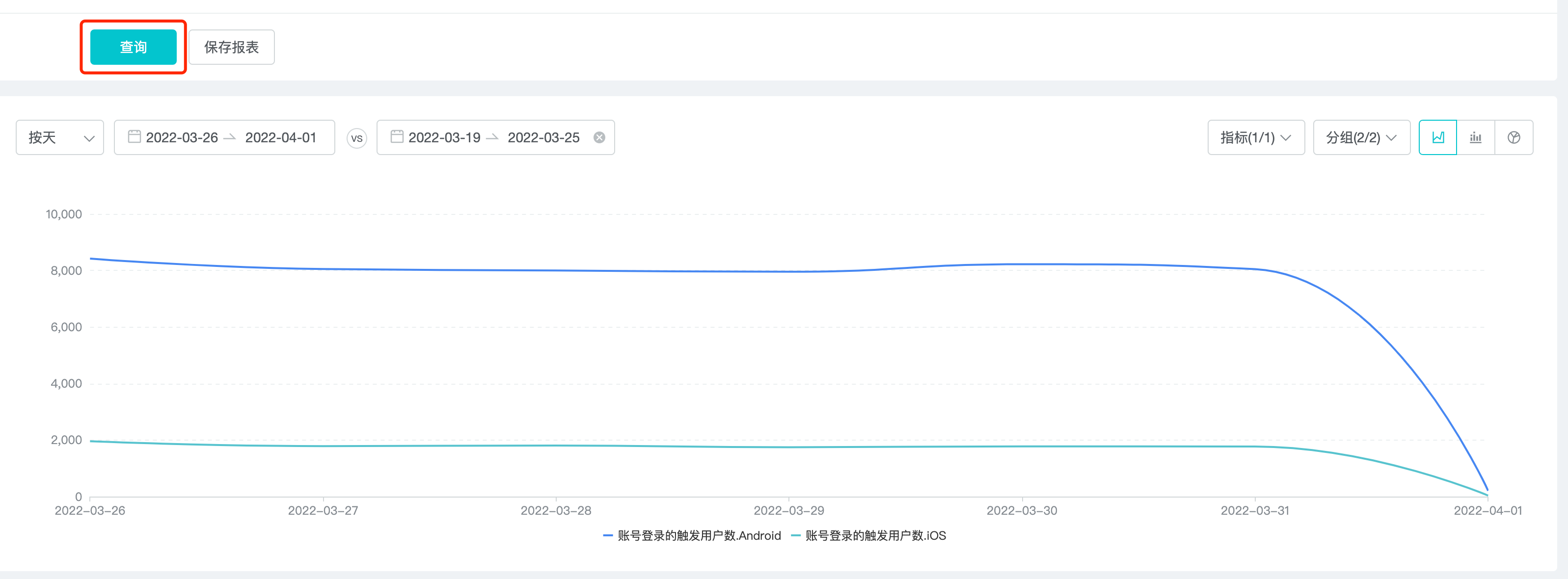
1、确定指标和筛选条件:要分析的是账号下的 DAU 和新增用户,分 iOS 和 Android 两端显示。
点击「选择指标」,在弹出的窗口里我们选择事件和筛选条件,并且对指标重命名(我们也可以在事件分析的主界面进行筛选条件的设置)。
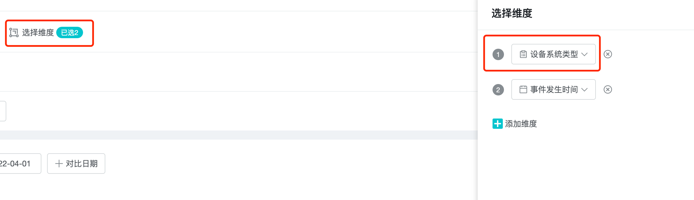
2、确定维度:iOS 和 Android 就是我们分析指标的维度,所以我们在维度选择里选择「设备系统类型」。
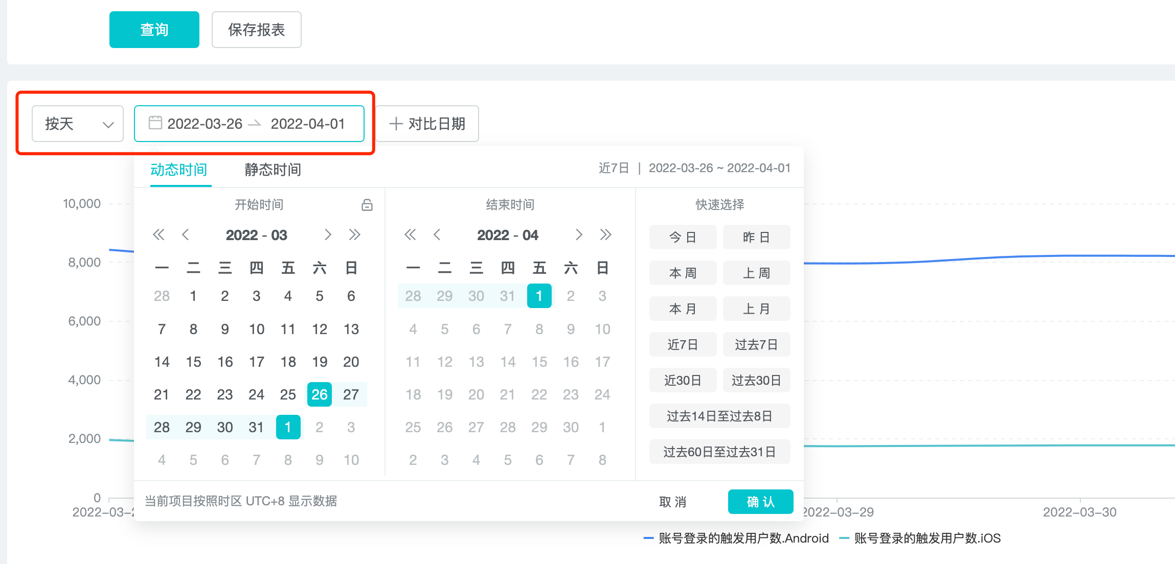
3、选择时间段:我们需要关注最近 30 天的数据变化,所以在日期选择器里选择「近 30 日」
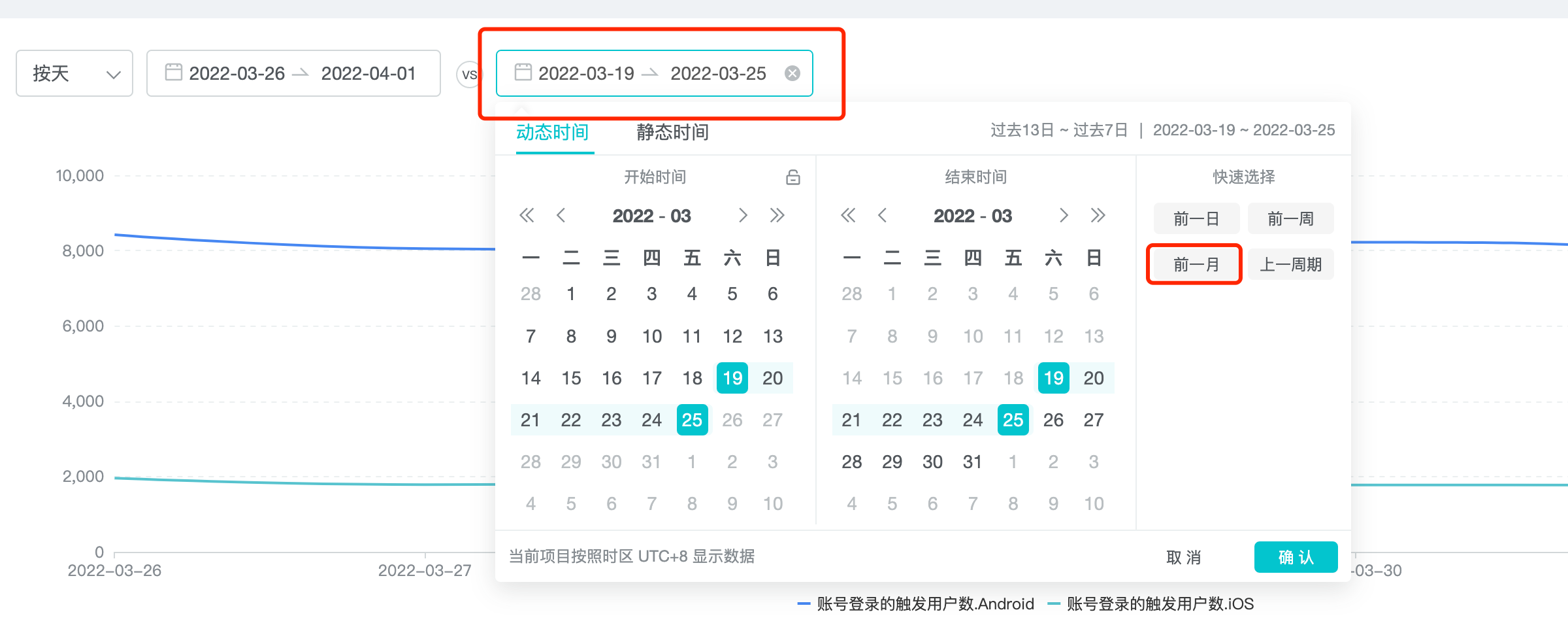
4、选择对比时间段:我们用最近 30 天的数据变化,对比前一个月。
条件已经设置完成,点击「查询」,输出结果。
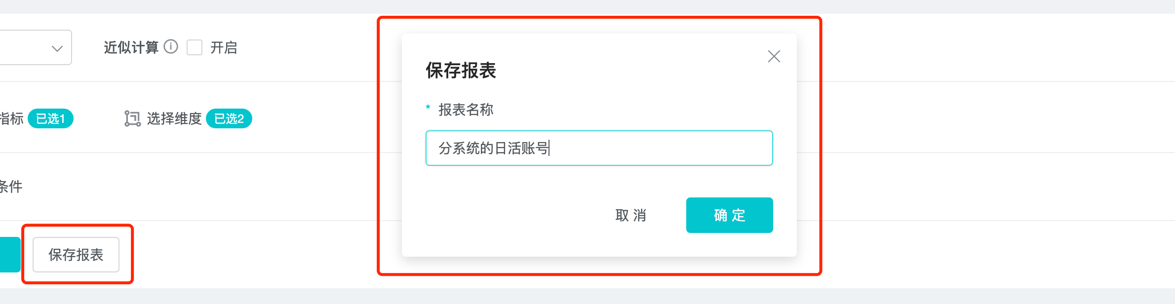
5、保存报表:我们将查询结果保存为报表。再将报表转变为看板,就可以每天方便快捷的看最终报表数据。
以上就是我们通过事件分析来查看分系统的日活用户的步骤。
二、什么是事件分析
事件分析本质上就是对事件的 what、how、when、where 进行分析。
三、事件分析的支持场景
1、人数:有多少人触发了某一事件
- 比如 UV、DAU 指标趋势;
- 比如说同一个按钮的文案做了调整,调整前文案为 A,调整后文案为 B,进行对照试验,分析 A 和 B 的点击情况;
2、次数:某一事件触发了多少次,比如对关卡每天的通关次数;
3、人均次数:某一事件(行为)平均触发多少次;
4、活跃比:在一个时间区间内,触发某一事件的人数占当前时间段内所有活跃人数的比;
5、事件细分维度下的数据:查看按钮点击事件,我按照设备类型展开,我就可以得到不同的设备触发的任意事件次数,这样我们就可以知道不同设备上的事件发生情况;
6、复杂指标的四则运算:当我们想要的数据没有在上报的数据里,怎么办?我们可以通过加减乘除进行指标计算得到一个新的指标,这种方式就叫自定义指标,比如 ROI,ARPU 值;
四、如何做事件分析
就像案例里提到的 5 个步骤:
1、选择指标和筛选条件;
2、选择维度;
3、选择时间段;
4、选择对比时间段;
5、保存看板;
4.1 选择指标
在确定指标时,同时需确定是否开启「近似计算」。
4.1.1 近似计算
开启之后仅查询部分样本的数据,准确率 99.9%,查询速度更快。
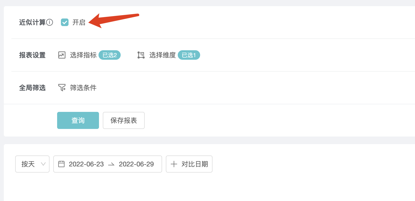
任意设置的调整,需点击「查询」按钮才能生效。
4.1.2 选择指标界面
在选择指标界面,包括「选择事件」、「选择属性」、「重命名」、「切换指标公式」和「筛选」功能,如下图:
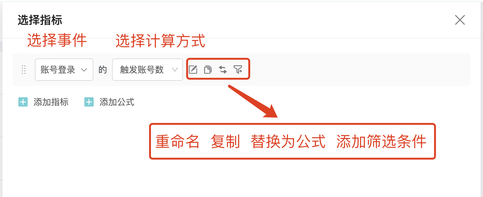
「选择事件」:下拉选项里可选择所有预置事件和自定义事件;
「选择属性或指标名」:下拉选项里展示事件的分析角度以及属性,如下图:
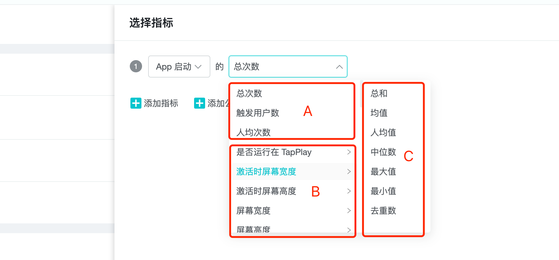
A:分析指标:任何事件都至少有这三个分析指标:总次数,触发用户数,人均次数;
B:属性:事件属性;
C:属性的分析指标:根据属性值类型,可存在以下分析指标:
| 数值类型 | 分析角度 |
|---|---|
| 数值型 | 总和、中位数,均值、最大值、最小值、人均值、去重数 |
| 列表型 | 列表去重数、列表元素去重数 |
| 布尔型 | 去重数、为真数、为假数、为空数、不为空数 |
| 非数值、布尔型 | 去重数 |
时间(支持的格式为 yyyy-MM-dd HH:mm:ss 或者 yyyy-MM-dd HH:mm:ss.SSS) | 去重数 |
「重命名」:将待分析的指标重命名,注意使用自己能理解同时别人也能理解的描述;
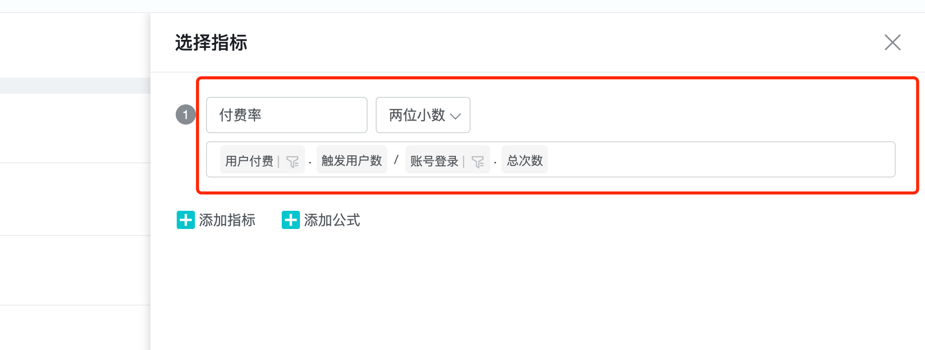
「切换指标公式」:点击后切换为四则运算型指标。这个功能主要用于某些特殊的比例型分析场景,我们来列举两个例子:
- 当天的活跃用户数占当月活跃用户数的比率,此场景下会将当前日期所在月份的活跃用户数作为分母参与计算;
- 当天的付费用户数占选定时间范围的活跃用户数的比率,此场景下会将所选时间范围的总活跃用户数作为分母参与计算;
比如我们通过指标公式来构建付费率指标
- 我们自定义指标名为「付费率」;
- 我们设置事件和指标公式「用户付费 - 触发用户数」/「账号登录 - 触发用户数」;
- 在设置好指标计算公式后,可以选择「百分比」、「两位小数」、「整数」三种展现样式,我们选择两位小数;
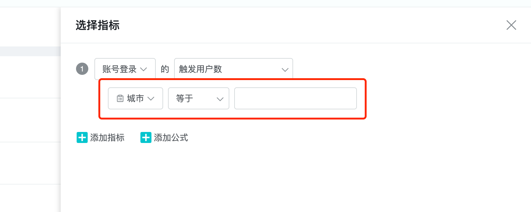
4.1.3「筛选」
点击后设置指标的限制条件。可在【指标选择】界面设置单个指标的筛选,也可在事件分析主界面,设置全局筛选。
4.1.4.1 筛选的数据类型
共有 5 种,分别对应支持不同的数学逻辑:
1、数值。比如:充值金额。支持数学逻辑:等于、不等于、小于、大于、有值、无值、区间
2、字符串。比如:事件发生的城市。支持数学逻辑:等于、不等于、包含、不包含、有值、无值、正则匹配
3、列表 ID。 比如:名单。支持数学逻辑:存在元素、不存在元素、元素位置、有值、无值
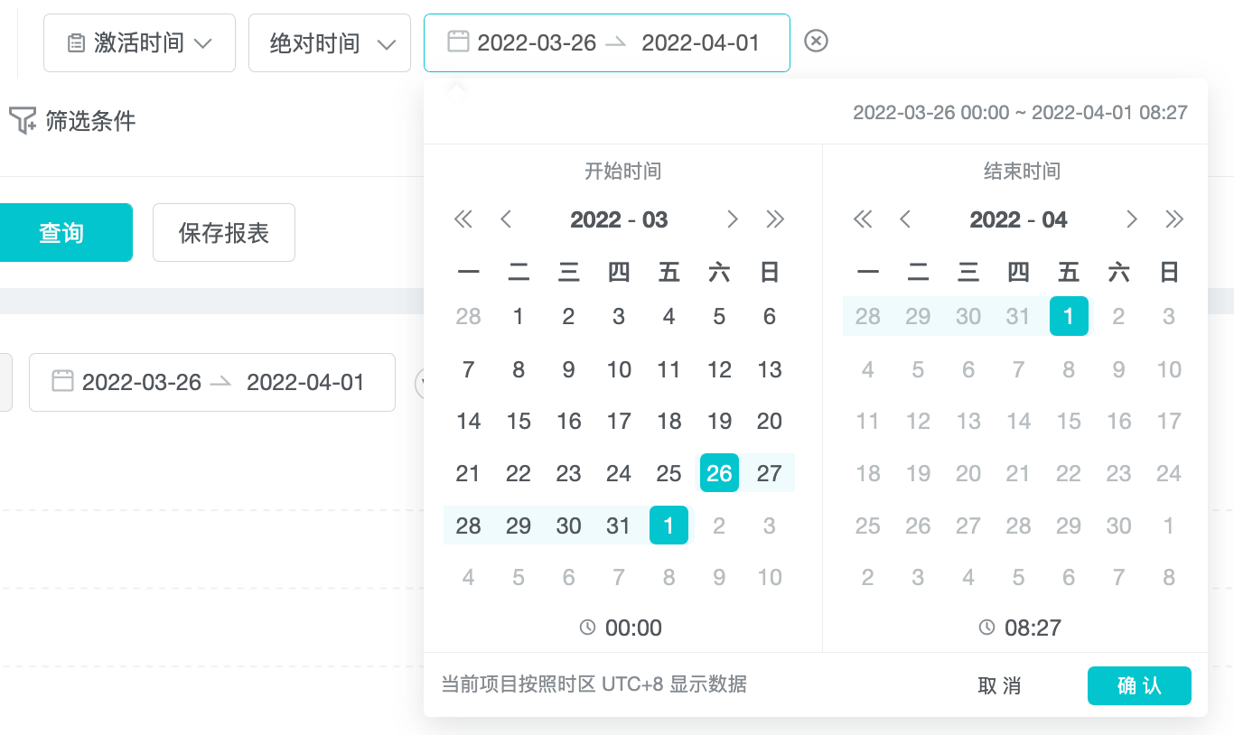
4、时间。比如:注册时间(yyyy-MM-dd HH:mm:ss.SSS 或 yyyy-MM-dd HH:mm:ss)。支持数学逻辑:绝对时间、相对当前时间、相对事件发生时刻、有值、无值
5、布尔。比如:Wifi 使用。支持数学逻辑:为真、为假、有值、无值
4.1.4.2 等于 / 不等于和包含 / 不包含的区别
等于 / 不等于:筛选项目中严格符合所选值才可被过滤,比如筛选条件:次大陆等于美洲,则仅查询美洲的数据。
包含 / 不包含:筛选项目中包含所选值即可被过滤,比如次大陆包含美洲,则美洲,北美洲,南美洲的数据都可以被过滤出。
绝对时间:指客观的现实时间。比如 2021-03-02 19:24:52 至 2021-03-08 19:24:52,前一时间必须在后一时间之前。点击「选择时间」可以精确到选择秒。
相对当前时间:指相对现在来说,过去 n 天。

相对事件时间:指相对所选的事件的前后 n 天。此处可选负数,比如 -1 天,则含义为所选事件发生之前的一天,如果所选为正数,比如 1 天,含义为所选事件发生之后的一天。

4.1.4.3 「且」「或」逻辑
可添加多个筛选条件。当筛选条件至少 2 个或以上时,会出现且 / 或切换按钮,默认是「且」。「且」即为多个筛选条件取交集,「或」为多个筛选条件取并集。
选择完筛选条件以后,点击查询按钮生效。
4.2 选择维度
4.2.1 维度介绍
维度是对事实的分解,它将指标进行分割以观察规律:
「事件发生的国家 / 地区」是一个维度,它的作用是将事实按照其所发生的国家 / 地区进行分组,从而观察指标的规律;
「用户群的年龄」是一个维度,查看不同年龄段的用户的付费数据;
「渠道包」是一个维度,查看不同渠道包下用户的留存数据;
时间是最基础的维度。
4.2.2 维度的分类
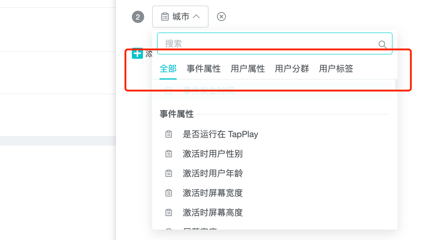
维度下拉框里可选择事件属性、用户属性、用户分群:
- 事件属性:描述事件发生时候的状态,比如:用户在美国充了多少钱?这里查询在美国(充钱的用户现在可能不在美国)发生的付费事件。
- 用户属性:描述触发事件的用户的状态。比如:现在在美国的用户充了多少钱?这里查询现在在美国的用户(包含曾经不在美国)触发的付费事件。
- 用户分群:即用户属于所选中的分群里的用户。
其次阐述二者在数据逻辑上的区别:
- 事件属性:即每一条事件所带的参数。比如通过 SDK 传「中秋节」事件,该事件带有 3 个属性,「中秋道具个数」、「粽子种类」和「用户购买龙舟数量」。在选择事件属性的维度时,可选的维度受到所选事件的约束,比如事件选定为「中秋节」的情况下,事件属性只能选择这 3 个。
- 用户属性:即用户表里的字段。用户属性不受所选事件的约束。
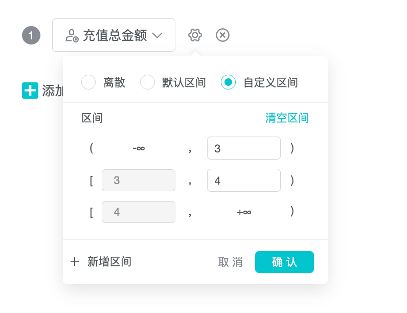
当所选维度为数值类型的字段时,比如付费金额,会出现区间的选择,离散区间即按照该字段所具有的所有数值进行聚合查询,默认区间为系统按照某规则设定聚合区间,自定义区间为客户可以自己定义区间段来聚合数据。
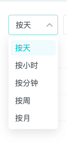
当所选维度有「事件发生时间」时,可选择时间的颗粒度,支持按天,小时,分钟,周,月。
4.3 选择日期
选择我们关注的日期。
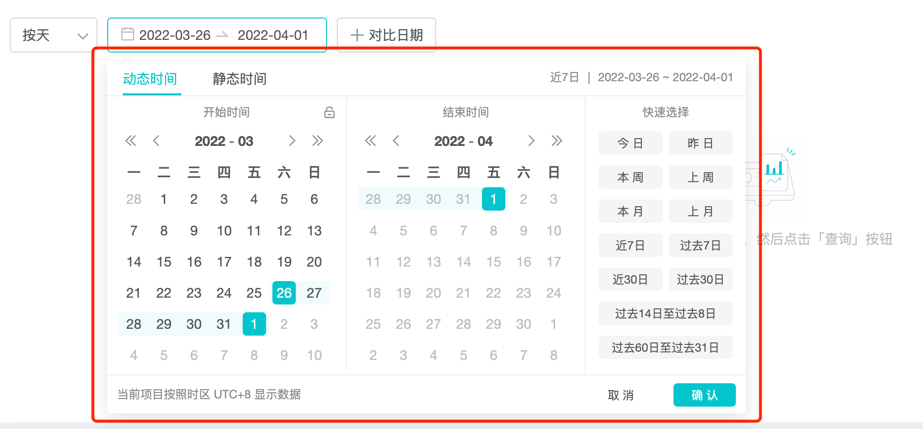
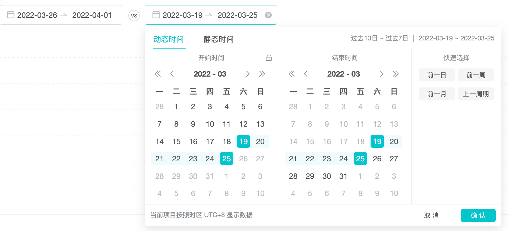
4.4 选择对比日期
对比日期与所选日期区间范围要保持一致,比如下图例子中,所选日期为 2021-3-2 到 2021-3-8,间隔为 6 天,则对比日期间隔也为 6 天。在选择对比日期时,只需要选择一个日期(比如 2021-02-23),系统会自动往后推算 6 天(至 2021-03-01)。
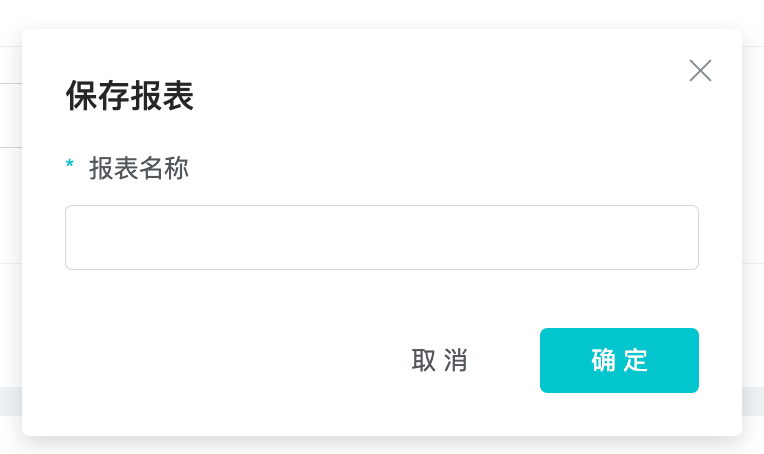
4.5 保存报表
选择完主维度和指标后,点击保存报表将该报表保存下来,输入名字后点击确认,则该报表被保存至「已保存报表」中。
首次保存某报表后,再次打开该报表即会出现「另存为」按钮,点击后另存为一张新的报表,若点击「保存报表」,则是更新之前保存的报表。

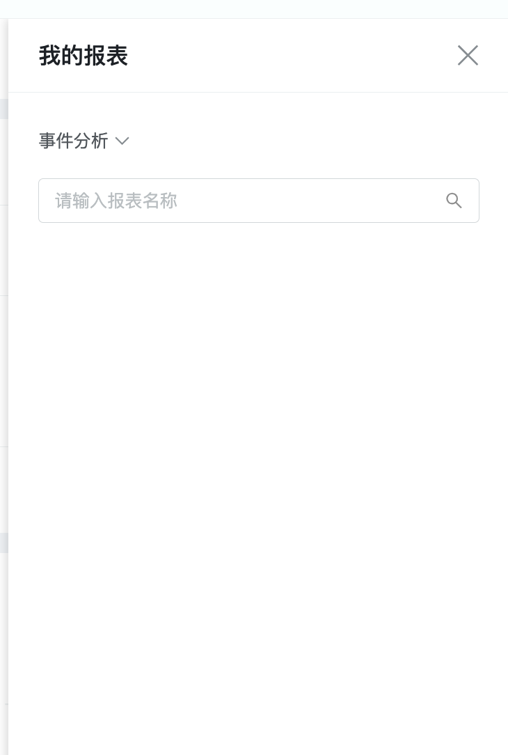
被保存 / 另存为的报表展现在屏幕右侧「我的报表」,可以点击自己保存的报表直接查询。
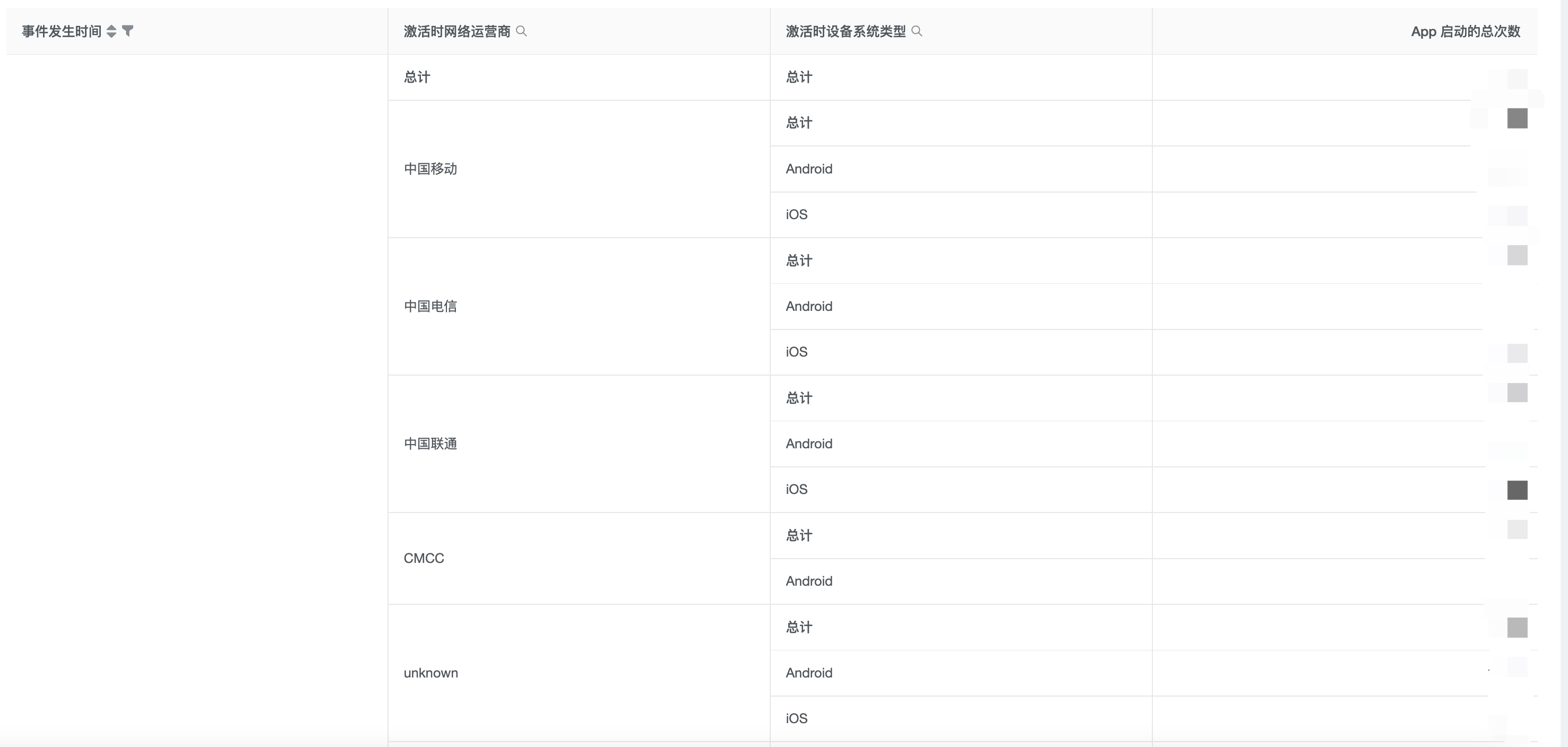
五、透视表
透视表是一种可交互的数据报表形态,其特点为所进行的计算与数据跟数据透视表中的排列有关。之所以称为数据透视表,是因为可动态改变数据的聚合维度的先后顺序,从而使得客户可以用多重角度观察数据。下面我们对比以下两张透视表:
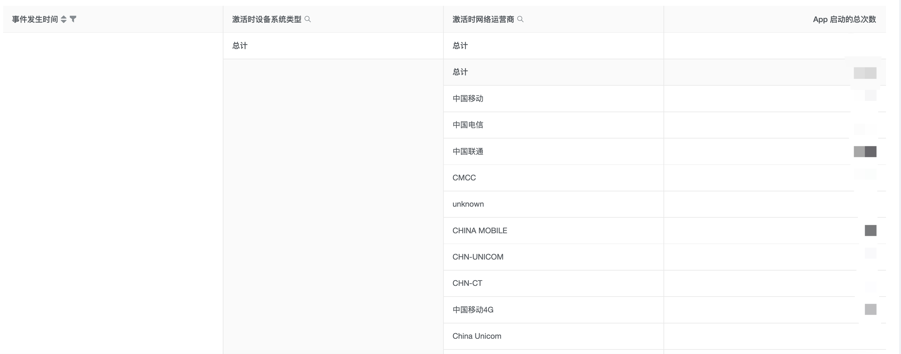
上下两张透视表(分别简称上表和下表,以下同)。
上表中,想要查询中国各省份当中,各设备系统及使用各网络运营商的用户的充值金额总和,即以「省份」视角透视拆分「设备系统」数据,进而又透视拆分「网络运营商」数据。
下表中,想要查询中国各网络运营商当中,各设备系统及各省份的用户的充值金额总和,即以「网络运营商�」视角透视拆分「设备系统」数据,进而又透视拆分「省份」数据。
5.1 可拖拽
透视表的每一列均可以用鼠标拖拽从而改变顺序。其中,维度被拖拽改变前后顺序以后,数据重新进入查询,即如同上表下表改变了数据透视拆分的角度。灵活运用拖拽可提高数据查询的效率。目前,透视表可最多勾选 5 个维度和 20 个指标。
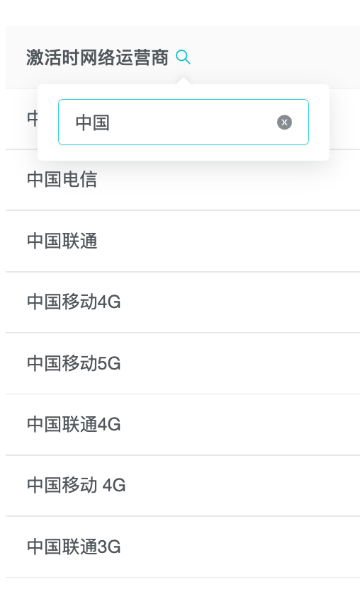
5.2 搜索
透视表的维度表头处,可以点击搜索输入文字,快速筛选出符合条件的项目,这里为结果筛选,筛选后不会重新进入查询。
5.3 排序
透视表的默认排序逻辑: 首先,对第一列主维度对应的所要排序指标的总计数据做从大到小排序; 进而,对第二列主维度对应的所要排序指标的总计数据做从大到小排序; 以此类推,对第 N 列主维度对应的所要排序指标的总计数据做从大到小排序;
5.4 下载数据
透视表右侧点击下载按钮,可下载平铺数据,下载结果为当前查询结果��,可以实现所见即所得。提供 CSV / PDF / 图片三种格式。